
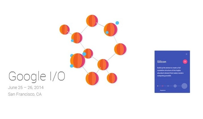
Google I/O kicked off on Wednesday morning. There is a lot to get to, so we will just jump right in. Google dropped some major bombs during the keynote address. The most important of which was the announcement of a new mobile OS, or Android L, as the company called it. This new version of Android represents one of the largest updates of Google’s mobile platform to-date. While there are a ton of new features and much expanded functionality, the main thing that jumps out from this update is the design. The UI is nearly a complete departure from Android KitKat. Google dubbed the new design concepts, “Material Design.”
It makes a lot of sense for Google to undertake such a bold redesign. Think about it. Apple fans’ main knock against Android, and Google in general, usually has the word design in it somewhere. These knocks generally have nothing to do with the functionality, usefulness, or the utility of a particular service or app; rather, it is usually boiled down to something like, “Apple products are designed so much better,” or “Google spends no time on design,” or some such nonsense. It is 100% clear that in terms of usability and function, Google is ahead of Apple, if only slightly. In fact, just after WWDC, Kyle – our Executive Editor, who used to be The Droid Guy – wrote about Apple’s propensity to incorporate Google features into iOS. Whatever the case, both Apple and Google are so far ahead of everyone else that it is really the little things that separate the two companies at this point. 1
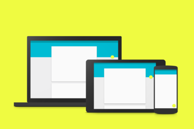
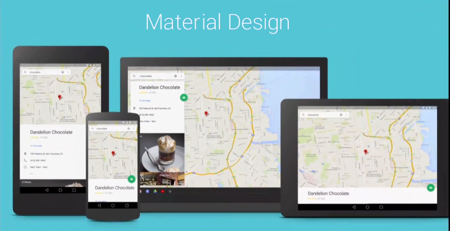
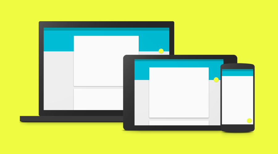 Now that the rant is out of the way, Google’s new Material Design is both that – a new design – as well as a way to bring a uniform experience across all devices. This is noted in Google’s overview of Material Design:
A single underlying design system organizes interactions and space. Each device reflects a different view of the same underlying system. Each view is tailored to the size and interaction appropriate for that device. Colors, iconography, hierarchy, and spacial relationships remain constant.2
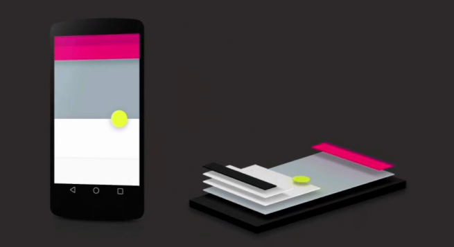
The “Material” in Material Design is more of a metaphor than a real description. “A material metaphor is the unifying theory of a rationalized space and a system of motion. The material is grounded in tactile reality, inspired by the study of paper and ink, yet technologically advanced and open to imagination and magic.”3 Thus, bland logo-based imagery is replaced with imagery to, “create hierarchy, meaning, and focus.”4
![]()
Further, there is a clear emphasis on animations in Material Design. This focus on animations goes back to the underlying principles of Material Design, “grounded in tactile reality.” According to Google’s Animation Principles for Material Design:
Physical objects have mass and move only when forces are applied to them. Consequently, objects can’t start or stop instantaneously. Animation with abrupt starts and stops or rapid changes in direction appears unnatural and can be an unexpected and unpleasant disruption for the user…A critical aspect of motion for material design is to retain the feeling of physicality without sacrificing elegance, simplicity, beauty, and the magic of a seamless user experience.5
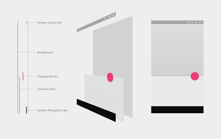
 There is also a substantial update to the overall layout of apps and the UI in general. Matías Duarte, Google’s Director of Android User Experience, described the new layout during the keynote:
The human mind, is wired at its most primitive level, to instinctively understand objects and their relationships. Those seams and shadows provide meaning about what you can touch, and how it will move. In the real world, every small change in position and depth creates subtle, but important changes in lighting and shadows…As part of the L preview, developers can now specify an elevation value for any UI surface.6
 This is only the tip of the iceberg as far as Android L is concerned. Look for much, much more in the coming days as we have a chance to sift through the Google Design Principles, and digest Google I/O in its entirety.
- Full disclosure – I am a big fan of Google and Android, an not so much of Apple. ▲
- Google.com/design “Material Design [PDF]” ▲
- Google.com/design, “Introduction to Material Design” ▲
- Ibid ▲
- Google.com/design, “Authentic Motion” ▲
- Google I/O Keynote, around the 42:00 mark ▲
Pingback: マテリアルデザイン?次々現れるマテリアルデザインのUIサンプルまとめ | 株式会社レジット